Friday, March 28, 2008

Alphabet: An Exhibition of Hand-Drawn Lettering and Experimental Typography

Alphabets: An Exhibition of Hand-Drawn Lettering and Experimental Typography is a gallery show in which 51 artists and designers from around the worls were asked to re-interpret the alphabet."The alphabets in the exhibition reflect a range of thinking about letters that encompasses the conceptual, illustrative, typographic, and beyond. Some of the artists have created their alphabets from a variety of non-traditional media or found objects, while others render their forms with pen and ink in obsessive detail. By presenting each alphabet removed from the context of words and typography, we focus on these 26 shapes as forms unto themselves rather than just the building blocks of words."http://www.posttypography.com/alphabet/alphabet.html

This experimentation brought about some interesting and diverse results. I've been contemplating making an alphabet from found objects for this brief and the images from this gallery show serve as great inspiration.

ANDREW BYROM / INTERIORS / 2003
A set of 26 table and chair frames built from steel tubing, Interiors forms a lowercase alphabet when viewed from certain angles. While some of the letters such as the h, m, and b look like basic chairs or tables, others like the e, t, and x become abstract, rather than functional, furniture.
Fabrication: Joel Wolter

APIRAT INFAHSAENG / SEVEN BOARD OF CUNNING / 2004
Constructed with Chinese Tangram puzzle tiles, Seven Board of Cunning takes the concept of Tangrams--that the tiles may be arranged into a variety of shapes--and applies it to typography, creating multiple versions of each letter.

MICHAEL STOUT (VISUALINGUAL) / IMAGEABILITY, PATHS / 2002
Pushing the limits of legibility, Imageability is a series of five fonts based on ideas from the book of the same title by Kevin Lynch. By reducing each letter to a minimal set of forms, Imageability explores the identifiers we use to navigate our landscape and language.

NANCY GUIRAGOSSIAN / DO YOU SEE WHAT I SEE / 2004
Using her camera to document letter-shaped elements in her surroundings, Guiragossian created her alphabet while wandering the streets of Montreal.

HJARTA SMARTA / SELECTED / 2002
Hjarta Smarta used a sewing machine to stitch the letters of Selected for a museum exhibition on Swedish crafts

REAGAN MARSHALL / BODY LANGUAGE / 2005
In the typographic ballet Body Language, a dancer contorts herself inside a specially-constructed spandex bag to create letters from the human form.
Performed by: Amy Oldham

photos and captions: http://www.posttypography.com/alphabet/gallery.html
Thursday, March 27, 2008

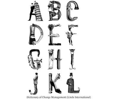
Collage Typeface

I stumbled upon this typeface and thought I'd share it with you all.
It's the work of German graphic designer Silja Goetz. I think the use
Victorian clip art, 1950's photography and illustration works very well to create and intricate, interesting typeface.

Hand Made

Hand rendered typefaces have been a dominant trend in graphic design for a little while now. I really appreciate this style and its endless treatments and applications. The use of hand renedered typefaces lends itself well to the design of t-shirt graphics, a venue I would possibly like to persue for the open brief. While researching I found this book entitled, Hand Job: A Catalog of Type by Michael Perry. Scandolous title aside this book features some great examples of hand rendered type which range from ironic to elegant.


Tuesday, March 11, 2008

I know this is not necessarily typography related but I just have to share my love for the beautiful textiles of Finnish design company Marimekko. Marimekko was founded in 1951 in Helsinki by Armi and Viljo Ratia. Viljo tapped into his previous experience working at an unsuccessful oilcloth company and recognized the lack of creativity in the textile industry. He enlisted Armi to seek out graphic designers and applied their works to textiles. In order to promote their new high-quality fabrics they designed and produced a well received line of dresses. Marimekko has since grown from its humble beginnings, boasting flagship stores around the world, with clothing lines for men women and children; as well as a ready-made home furnishing collection.


What draws me to Marimekko's aesthetic is the use of bold color palettes and refined patterns. Their textile designs achieve the rare feat of simultaneously being modern and classic, a testimony to this is the iconic Unikko pattern. This pattern was created in 1964 by designer Maija Isola after Armi Ratia announced that no floral fabrics were to be designed at Marimekko due to their connotations with antiquated aesthetics. Isola broke the rules and instead created a design which proves that florals can be bold and modern. Unikko is just as popular today, with countless products available in the pattern.


Kate Moross


This is Kate Moross.


First off I must say she makes me so jealous. At 21 years old she's already collaborated with reputable companies such as Sony, 55DSL and Cadbury; designed magazine covers and posters and lets not forget her limited edition capsule line for famed UK fashion retailer Topshop. Jealous yet? I appreciate the playful, whimsical quality of her work and the juxtaposition of psychedelic, organic elements with isometric forms. check her out:http://www.katemoross.com/